At this year’s Mane Event, we announced the launch of the new brand for Colorado Horse Rescue. Today, we want to take a moment to further explain why we need a new logo and why it is the right time for CHR.
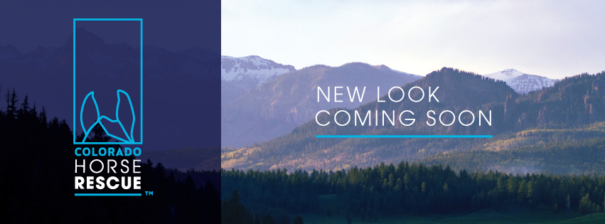
New symbol: Inspired by the alert perky position of a horse’s ears, combined with a line work illustration of the Colorado mountains.
This evolution is being made with great intention and is not just change for the sake of making a change. A good reason to refresh a logo is that it’s not doing the job you want it to do – and because a simpler, more distinctive version could do that job better. Our old logo is very special to us, and we’re sure it remains special in many of your hearts as well. However, as our vision for CHR evolves, our capabilities expand, and our impact grows, our logo needs to be able to adapt with us.
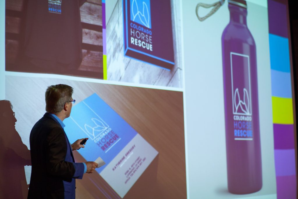
CHR’s new branding at the Mane Event.
Months ago, we sat down as a team to brainstorm what we want our logo to communicate about us. We want our logo, branding, and messaging to not only reflect our Rocky Mountain roots, but also differentiate us from other organizations. We have created a simple, iconic identity for CHR as a leader in our industry and a champion for horses. Our new branding is optimistic, modern, and forward-looking… just like Colorado Horse Rescue.

Over the next few months, you will see the new branding unfold across our digital platforms as well as at the rescue. Make sure to check chr.org and all of CHR’s social media platforms for more sneak peaks of the new branding.
Thank you for your continued support. We are so excited to share this news with you and to continue making a greater difference for at-risk horses with you on our side.
Sincerely,
The CHR Team